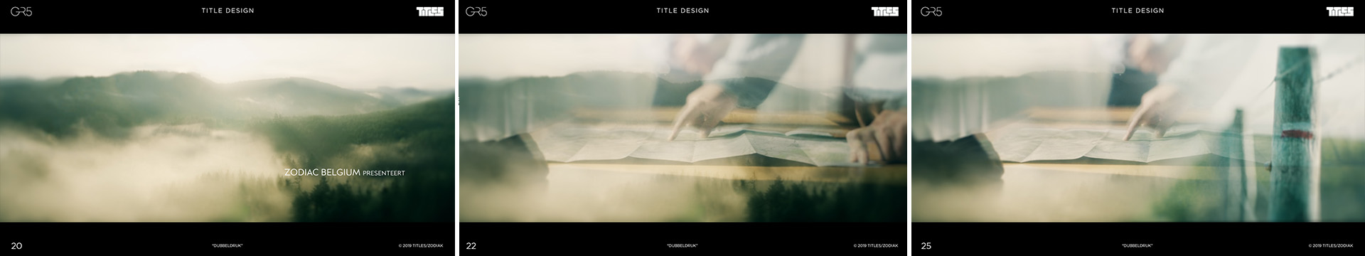
GR5 tells the story of a group of young adults, hiking the 'Grand Route N°5', from the Netherlands, all the way down to Nice, France, 5 years after they lost every contact with a dear friend, walking that very same route.
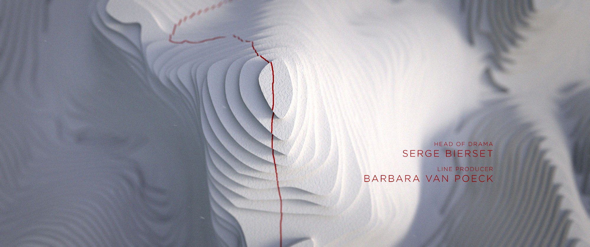
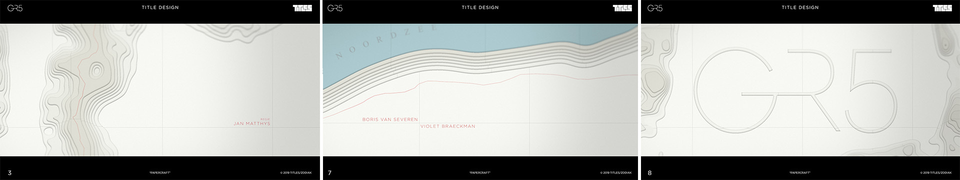
After meeting with the creative team behind GR5, showrunner Serge Bierset and director Jan Matthys, it was quite clear they were looking for us to create an opening credit design based on those typical visual language, you can find on topographic maps. We created some internal explorations for the piece, but one solution (our favorite) was unanimously approved by our client. Using the topographic idea as a starting point, we shaped a maquette-like world made of white cardboard, highlighting some of the series more important (or visually more interesting) locations. This was a particularly challenging project for us as it was our first fully CG animated piece in photorealistic 3D.
Pitch
After our first meeting with the people from Zodiak and viewing some brief edits of the first 3 episodes, our team started to work on some concepts for a first client presentation / pitching session. We came up with four concepts.
Our first concept was called Cardboard and we pitched our idea as the love child of the title sequences for Le Casa de Papel and Game of thrones : a voyage through landscapes on maps, but all shaped as a classic cardboard architectural maquette. A red line describing our main character's route on top of the white paper surface. Red on white, referring to the colors, marking the GR5 route. From the four concepts we presented to the client, this was the team's favorite version, but also the most difficult one to pull and unfortunate... the most expensive.
Papercraft
The second concept was called Kaleidoscope. We used interesting landscapes and landmarks of the series and placed some mirror effects on top of them. Referring not only to the fact who walks the GR5 will run into himself, but also to the different characters of the series, who all have their own agenda's and hiding things for each other. Smoke and mirrors!
Kaleidoscope
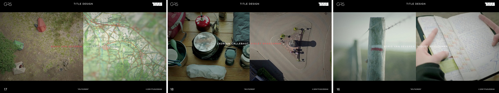
Our third idea was the Splitscreen and was just, eh... splitscreen, combining landscape and things on paper like topographic maps, Lisa's diary, old photos,...
Splitscreen
And our fourth idea was our budget solution. It was called Double Exposure. Since the budget was not quite clear at that time, we also pitched an idea that was just an edit (maybe even edited by the editor of the show itself) with beautiful masked dissolves between each shot.
Double Exposure
After the presentation, we felt Jan (the director) and Serge (showrunner) were very exited about the first idea with the cardboard landscape. So since this was also our number one choice, we had very high hopes on this one. A few days later the message came in we could start working on it. So our team's own 3 months GR5 hike started here.
Storyboard and first animatic
We started viewing all 8 episodes in first draft and made a long list of every happening, location or landmark that could be useful to our opening sequence. We ended up having a printed 30 pager full of stills (about 240) to choose from and started storyboarding, what led us to a set of 15 keyframes.
Storyboard
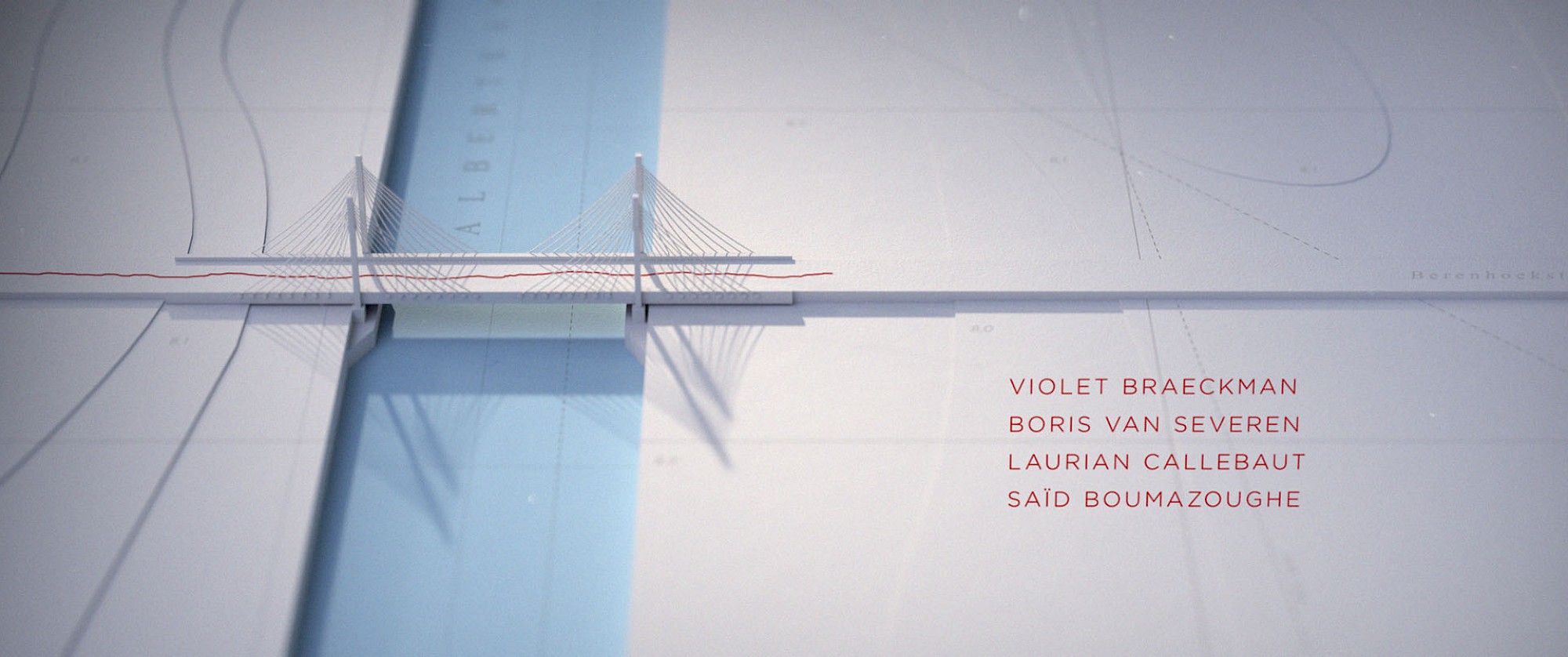
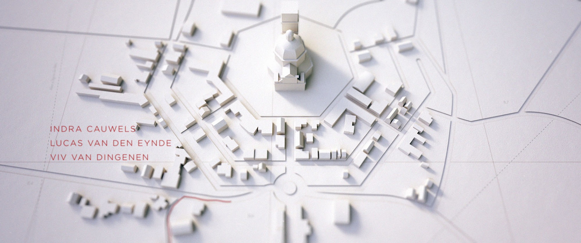
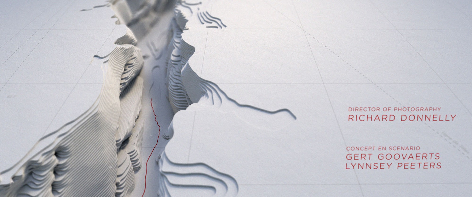
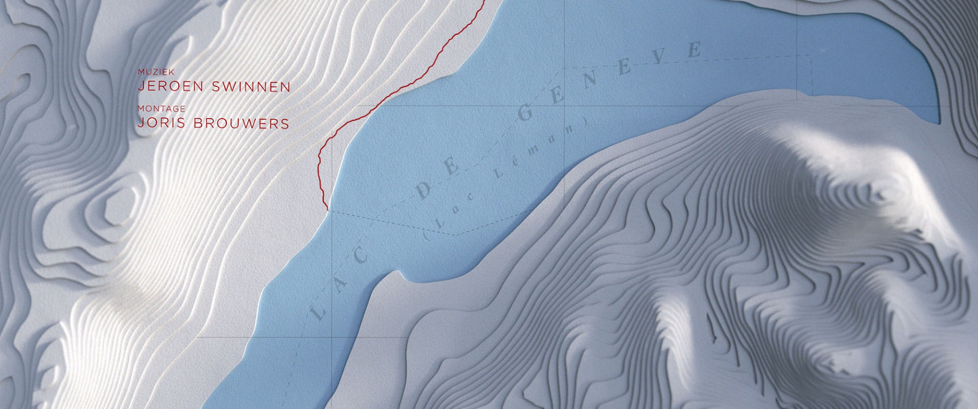
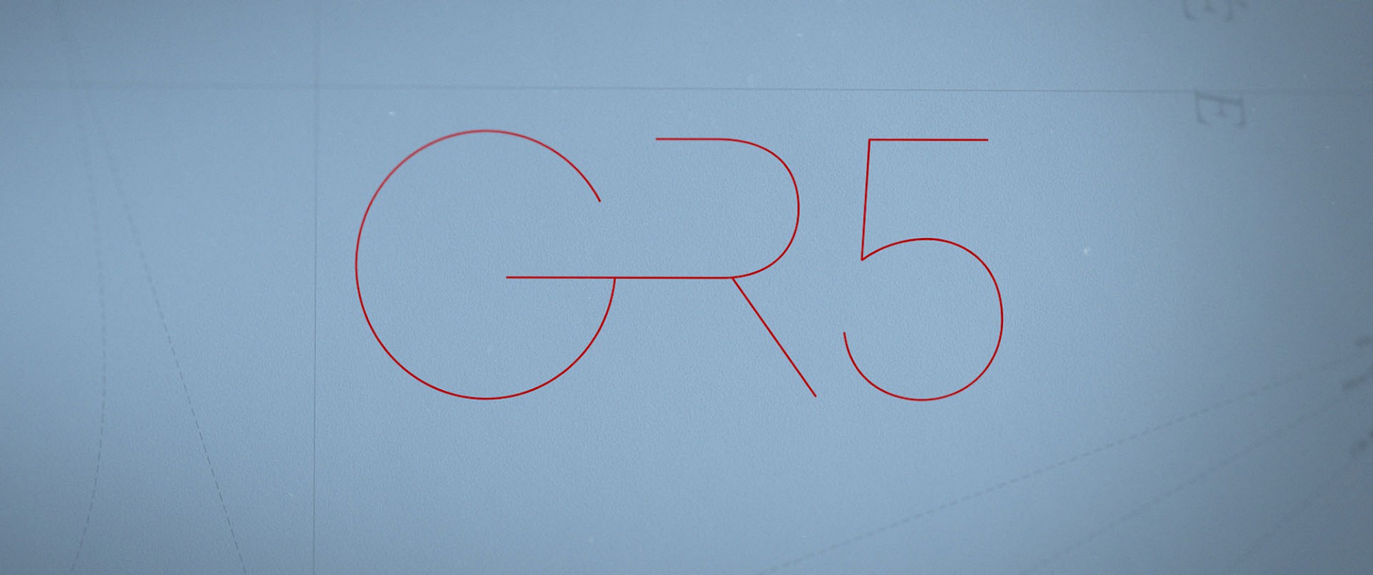
Almost all frames were topshots to emphasize the topographic feel we had in mind and must have water or mountains in it, what would work nice with our cardboard layers. We started above the clouds, traveled in on the North Sea, went to the big church in Scherpenheuvel, over the strange (but cool) looking bridge over the Albert Canal and flew over the woods. Then we traveled over a rocky pass, flew in on the Grand Ballon, dove in on a small river with a strange lookout and crossed the Lac de Geneve. We entered the Alps, climbed a mountain edge, walked on a dam in a lake, again a small rocky pass, flew over a hill top with a cross on it, saw the cost of Nice in the distance and flew over the Mediterranean, revealing our GR5 title logo (designed by Amira Daoudi).
When production greenlighted our storyboard we started working on an animatic and discovered that 14 shots were just too much to fill in our 45 seconds slot, so we decided to throw out some stuff and bring the count back to ten.
Research and Modeling
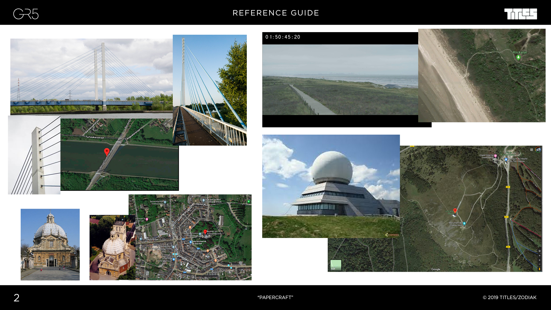
Then we did some research on the locations we used in our film: This cool bridge, for example, how is it rigged and how is it implanted in the surrounding area? How does Le Grand Ballon looks like? Which part of the Lac de Geneve we want to use and where are GR5 hikers crossing it exactly?
some research reference on locations
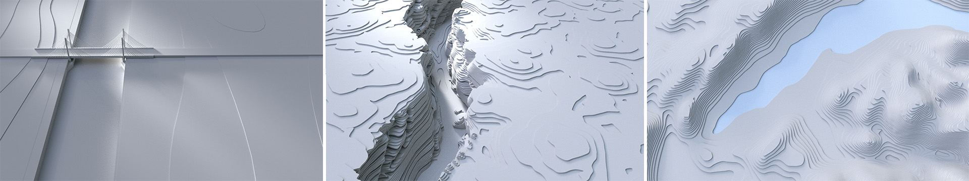
Once we were happy with the details, Freek, our 3D modeller took over and created 3D scenery for all shots in 3ds Max. He also came up with some nice idea's for the look of the trees in the wood shot. After some back and forth on the model designs between Freek, the series creative team and us, all .obj files were given back to our team to animate the camera movement and set up some rough light directions. Along with some highres rendered 3D frames, we presented a first playblast animated version to the client.
Highres still frames
After the presentation, everybody was happy, although there were some minor requests from the director's side on the model design. For example, in the shot with the lookout over the water, where the camera dives into, they wanted the lookout replaced by a waterfall, so we changed that. After sending some new ref frames to production, everything was greenlighted, so all animated shots, textured and lighted by Freek were uploaded to a cloud renderer so we could start finishing the film.
Finishing
When all highres renders were in, we started compositing the film. We painted in our animated red lines, topographic elements and grids, added some depth of field and extra grain, and put our credits on top. All linked, of course, to our 3D camera data. The first version we showed to the client, was a work in progress, still experimenting with typefonts and positions for all added elements, and yet, not completed.
From that moment everything went quite fast. Up till now, we saw the show's creative team on a weekly base, but for this last miles, we had Jan Matthys almost everyday on the phone or in real life at our studio, which was fantastic and gave us the ability to make decisions very quickly. We experimented with different tints of red, changed places and directions for the animated lines and credits and even reversed some shots. Also Jan came up with the idea to add some very subtle dust particles in the shots, to make it even more photorealistic. And that worked like a charm!
But when we laid the last hand on the film, Jan and our team felt there was something wrong. Everything looked great, but there were two shots that didn't quite match the rest of the film. We're talking Le Grand Ballon shot and the Alps shot (second last)... While all other scenes were filmed from the top, these two were quite frontal, so we were missing everything that makes all other shots so nice. We didn't see grids on the surface, no paper texture, no dotted lines and above all, there was no water in the shots, while almost all other shots have something of blue in it. We decided to take that very last mile and completely redesign those shots the last week before final deadline.
And I'm glad we did.
Thank you Jan, Serge, Wim and Freek for this amazing journey!