Downside Up

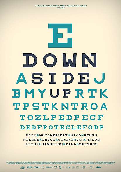
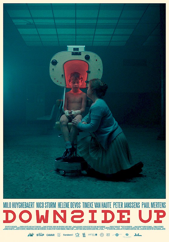
For Downside Up by director Peter Ghesquière and produced by a Team, we finished the title design before we started crafting the poster. Our team had some clear ideas about using the same 'Snellen chart font' as we used in the film titles, but then production handed us some breathtaking stills from set. We decided to combine the two, what resulted in a very satisfying design featuring only blueish and red tones. Besides that, we also created an alternative version for the poster that was only text based and fully inspired by the Snellen Charts.
